http://www.bodyscan.human.cornell.edu/feature_bodyscanner/img/narrative_sizingresearch/easegraph4.gif
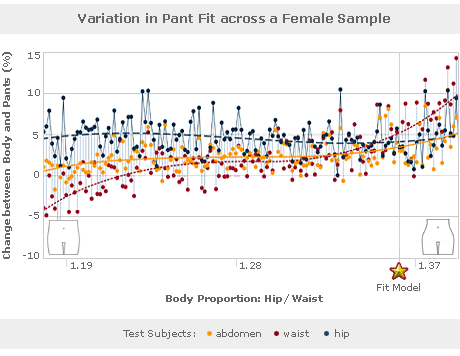
This is an example of a model graph. It evaluates the percentage change between body and pants (the space between a woman's jeans and her body) with hip to waist ratio. The graphic visualization is very well done, and accomodates a precise and detailed set of data without an excess amount of ink. All of the data points, colors, and lines are motivated and have reason to be there. Each data point is connected to the model wave with a subtle blue line, which represents the deviation between the actual and ideal data point. Each of the three model waves are distinctly rendered using different colors and different kinds of lines (continuous line vs. dotted line vs. broken line).

No comments:
Post a Comment